Hey folks, how's it going?
Lately I've been pushing my work toward the product engineer side. In practice that has meant looking at user behavior data to find possible pain points and improvements.
This post is about a recent case of mine that worked out really well! From reading the heatmap to the measurement two and a half months after the deploy.
The signal
I was digging through Microsoft Clarity on an application from work, looking at the last 90 days, with no hypothesis in mind. Just sweeping heatmaps for odd patterns.
And there was a red streak in a place that made no sense at all: on top of a long numeric identifier, inside a block of user information. Static text. No link, no button, etc... nothing clickable.
It had 2,198 clicks! That's 0.13% of every click on the page.
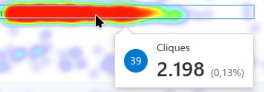
An element that does nothing being one of the most clicked spots on the screen is a very loud signal. Clarity classifies part of it as a rage click, several clicks in a row on the same spot, which usually means frustration.
Worth pointing out this didn't come from a ticket, a meeting or a user request. It came from watching user behavior data.
Reading the data
Quantitative data tells us where. It just doesn't tell us why. But sometimes you can figure it out pretty fast.
My reading: the user is trying to select and copy that number to take it into another system. They click, drag, miss the selection, click again, grab half of it, try once more. Every successful copy costs a bunch of clicks.
What made me confident in that reading:
- The pattern showed up in other sections of the page too, just far less frequently. What was different about this section was that the content is a long number the user needs to take somewhere else.
- A long number is exactly the kind of content that's annoying to select with a mouse, especially when it sits right next to other elements.
- There was no other possible action on that element. A click there can only be selection.
The hypothesis I landed on: there's no copy action, so the user copies by hand. That may well point to frustration.
The proposal
The solution is about as simple as it gets: a copy button next to the number. Trades N selection clicks for 1.
I brought it to the team with two options drawn up:
Option A: icon only, with a "Copy number" tooltip on hover. Cleaner, doesn't break the alignment of the information block.
Option B: icon + label, with the label switching to "Copied!" after the click. More explicit, but visually heavy in an area that's already dense with information.
The team approved it that same afternoon and picked the icon. Two good suggestions came out of the discussion and made it into the implementation:
- keep a visual "copied" feedback even in the icon-only version, because without feedback the user doesn't know whether it worked and clicks again (meaning: you'd fix one rage click and create another);
- make that feedback disappear on its own after a few seconds, returning to the normal state.
I opened the PR the same day. Deploy a few days later.
The first measurement
Two weeks after the deploy, I compared two 6-day windows, one before and one after the button existed:
| Window | Button | Manual selection | Total |
|---|---|---|---|
| 6 days without button | — | 1,928 | 1,928 |
| 6 days with button | 284 | 406 | 690 |
| Change | — | −79% | −64% |
A 64% drop in total clicks to copy the identifier! \o/
At first glance it looks like 59% of copies are still manual, which wouldn't be a great result.
But at that point the habit of using the button hadn't settled in yet. Six days is too short to know.
Two and a half months later
I went back to Clarity on October 2nd to collect data again, this time with 30-day windows. All three windows have nearly identical traffic volume, between 44k and 46k pageviews, so the raw numbers are comparable with no normalization.
| 30-day window | Pageviews | Button | Manual | % on button |
|---|---|---|---|---|
| 1st month with button | 45,852 | 762 | 810 | 48% |
| 2nd month | 44,818 | 419 | 302 | 58% |
| Last 30 days | 44,073 | 855 | 69 | 93% |
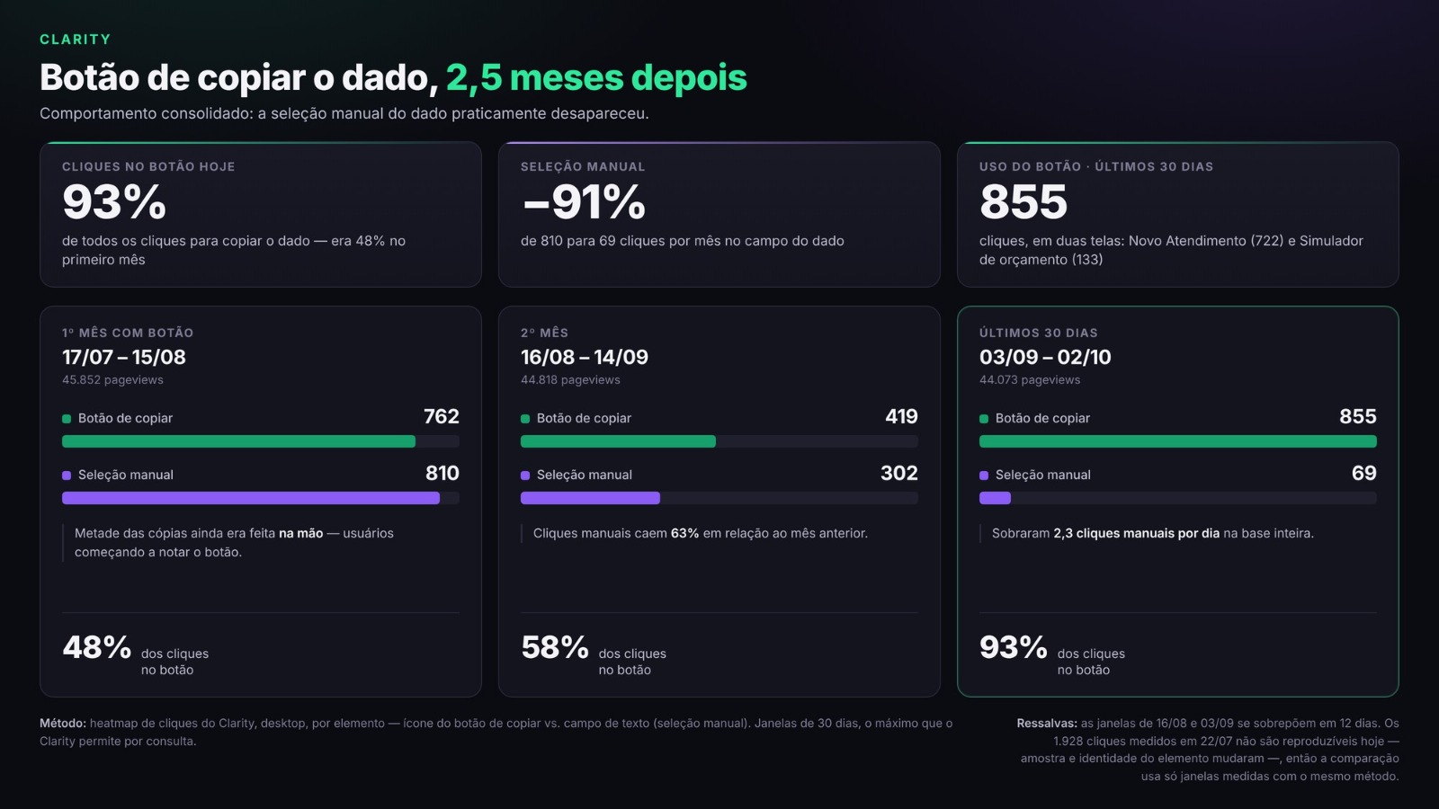
What this data says:
Manual selection dropped 91%!! From 810 to 69 clicks per month. That's about 2.3 manual clicks per day across the entire user base, so it basically became residue! \o/
The button became the default path. The share of clicks going to it climbed 48% → 58% → 93%, a consistent curve month over month. That means adoption kept rising.
Usage grew in absolute volume. 855 clicks in the last 30 days against 762 in the first month, with slightly less traffic.
That's exactly the hypothesis I had raised at the first measurement: manual copying would stay high for a while and fall as people got used to the button. That's what happened, I just couldn't claim it until two and a half months later.
Method and caveats
How the numbers were collected. Clarity click heatmap, desktop view, counting clicks per element: the button icon's class on one side, the text field row on the other. When the same element appears on more than one screen, the occurrences were summed.
The 1,928 clicks from the first measurement aren't reproducible today. The heatmap sample and the element's identity have both changed since July. So the month-over-month comparison only uses windows measured now, with the same method, which means the July number stands as historical context, not as a basis for calculation.
A click is not a copy. One button click equals one copy; several manual selection clicks may equal a single one. That means the real improvement in effort per copy is larger than the raw click drop suggests, and also that I can't translate any of these numbers into "number of users".
What we can learn from this
Sweeping heatmaps with no hypothesis is worth it. This pain never showed up in a ticket, a survey or a meeting. Nobody opens a ticket saying "I had trouble selecting a number with my mouse" haha, they just get annoyed for three seconds and move on. Their behavior is the only place it gets recorded.
A click on a non-clickable element is always a question. It's the easiest pattern to spot on a heatmap and it almost always means the user expected an action that isn't there.
Decide how you'll measure before you ship. Without that 6-day window from before the deploy, afterwards I'd have had a nice-looking number like "284 button clicks" with no basis for comparison.
And go back and measure again. This part really matters and sometimes we forget. In the rush you end up shipping a lot and nobody goes back to measure the metrics of what already shipped, the impact, etc... If I had stopped on July 22nd, I'd have recorded "−64%, but 59% still copying by hand" and been left guessing. The two-and-a-half-month measurement is what showed the behavior actually changed, and not just on the first novelty impulse.
And a technical detail: the button's icon comes from Font Awesome and it doesn't render in Clarity's session recordings, the area looks visually empty in the replay. Clarity detects the element and counts clicks normally, but if you go validate by watching recordings alone, you'll think people are clicking on nothing.
Conclusion
The deliverable itself is a copy button. A few lines of code. The UX gain is small and localized.
Finding the problem was the work, solving it was much easier. And going back to check two months later is what really let me put numbers on the delivery.
If you have Clarity, Hotjar or anything similar running on your application, it's worth opening the heatmap when you have some time, without looking for anything specific. Good chance you'll find something that turns into a new feature or smooths out the user experience.
Any questions, I'm around. Take care!
Liked the content? I accept a contribution! :)
PIX (Brazil Only): gabrielmonteiroduete@gmail.com
Buy me a coffee: ko-fi.com/gabrielduete (opens in a new tab)
Have something to contribute?
This blog is open source, so feel free to open a PR in the repository. (opens in a new tab)
Find me also in:
- GitHub: @gabrielduete (opens in a new tab)
- LinkedIn: @gabrielduete (opens in a new tab)
- DEV: @gabrielduete (opens in a new tab)
- Tabnews: @gabrielduete (opens in a new tab)
- StackOverflow: @gabrielduete (opens in a new tab)
- Beecrowd: @gabrielduete (opens in a new tab)
- LeetCode: @gabrielduete (opens in a new tab)